NEOSTRATA KV’S
kV designs for overall brand, enlighten line and skin active line.
NEOSTRATA RELAUNCH
CONCEPTUAL PRODUCT SHOOT
NeoStrata is a hyperpigmentation-focused skincare brand that treats a range of skin discoloration issues. Each collection treats a specific type of discoloration. (i.e. dark spots, melasma, acne marks, redness, uneven skin tone). The challenge of this relaunch shoot was to create brand awareness, connote science and efficacy and communicate how each collection of products treats a different type of discoloration.
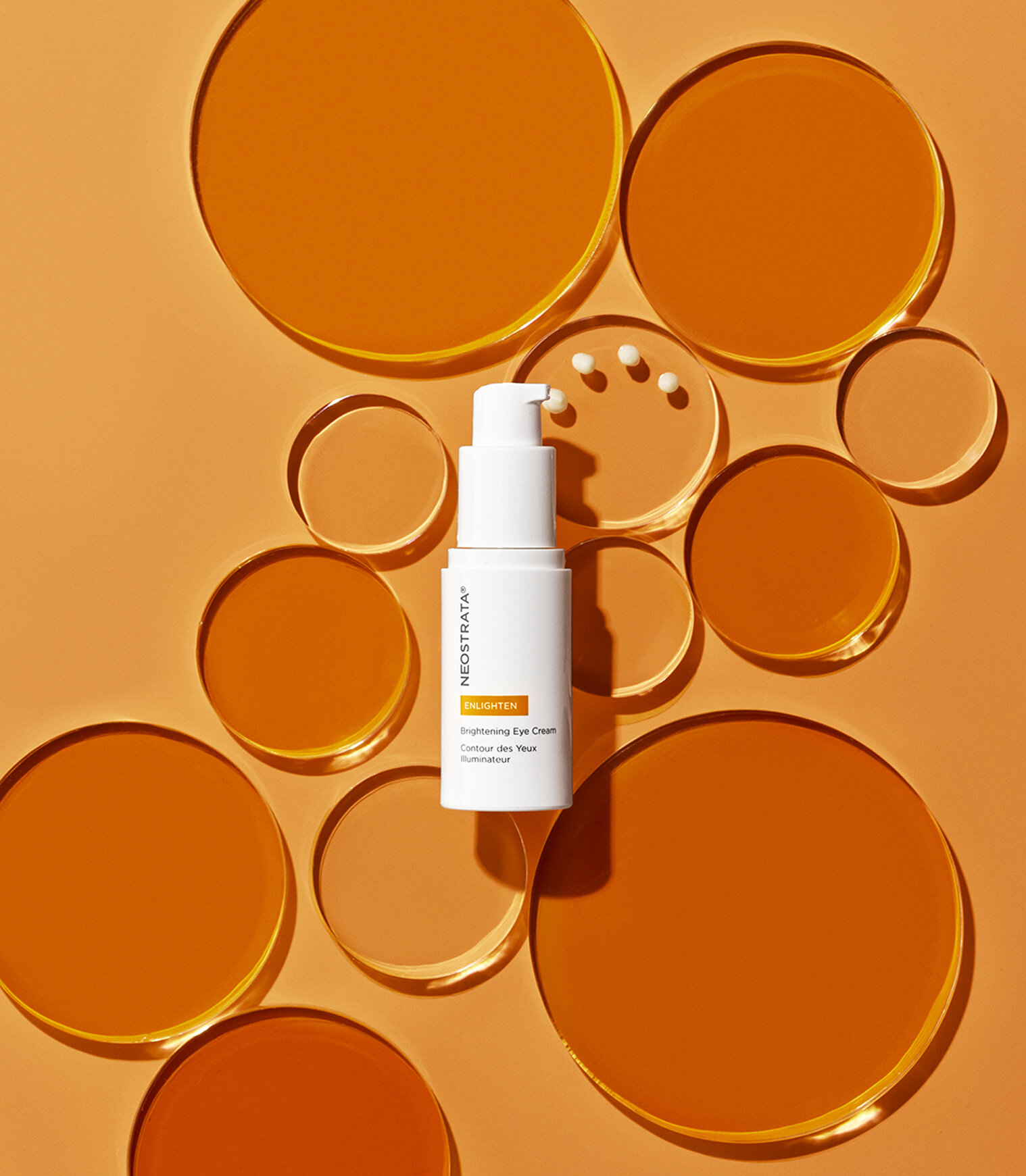
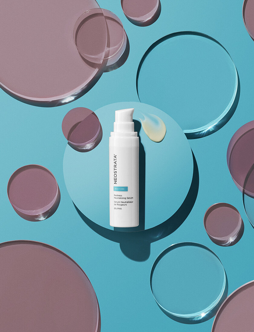
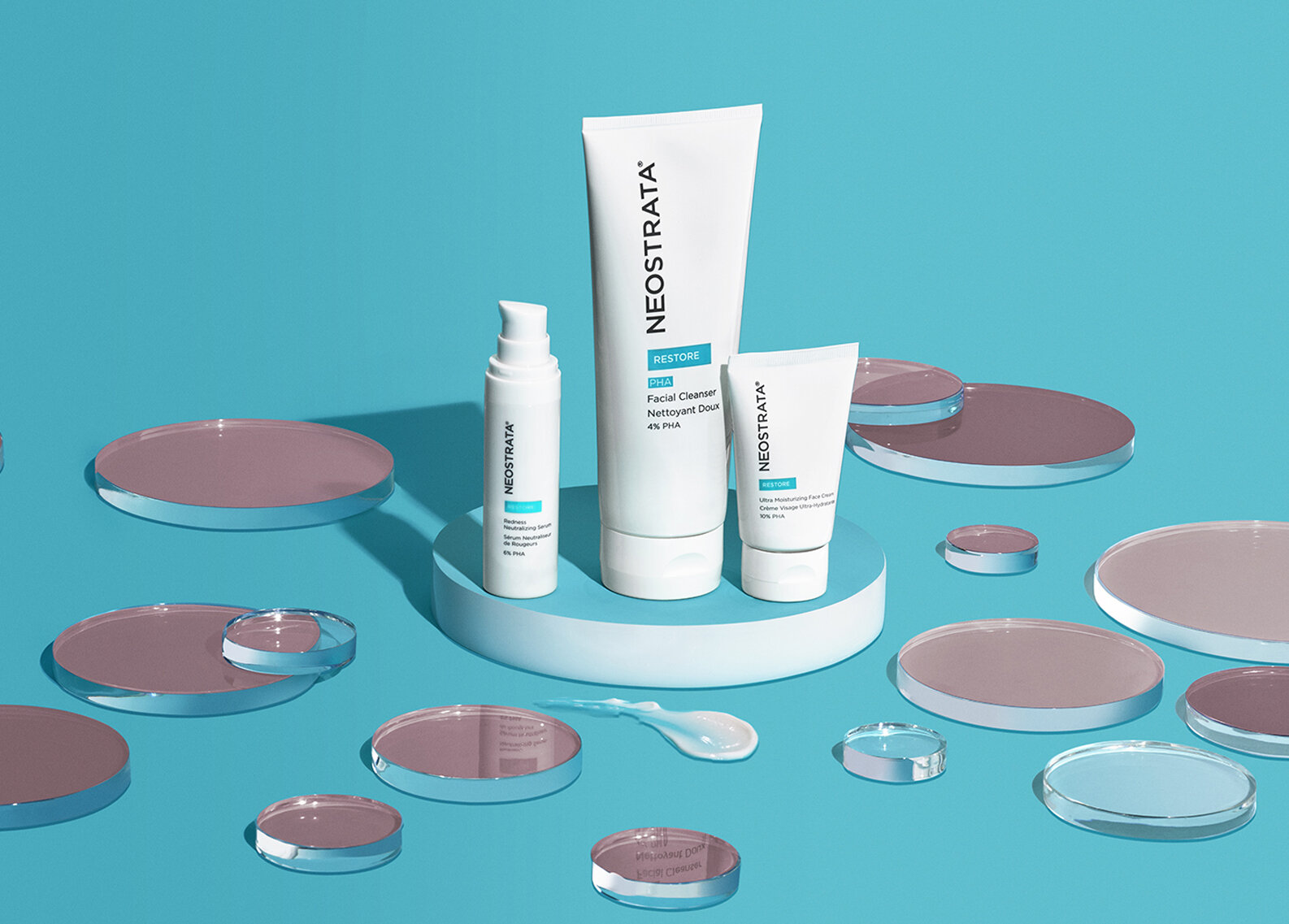
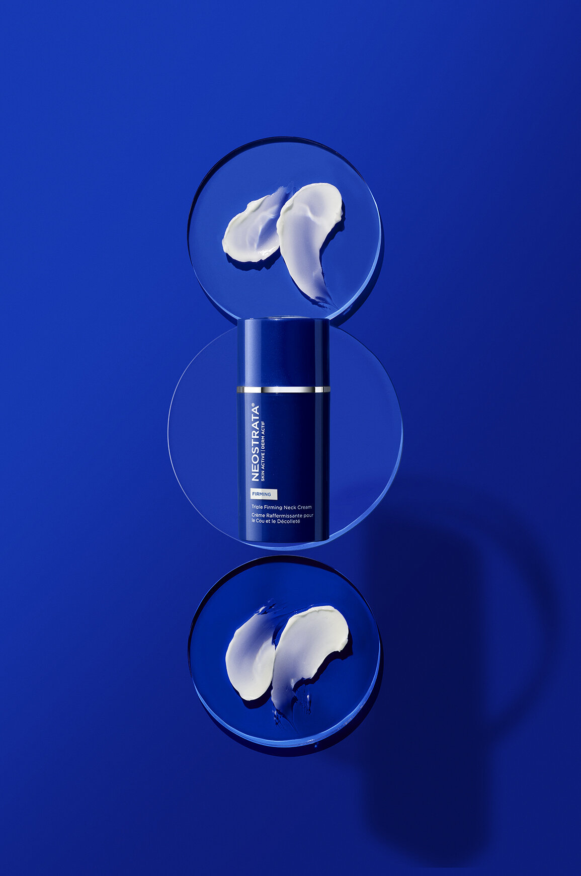
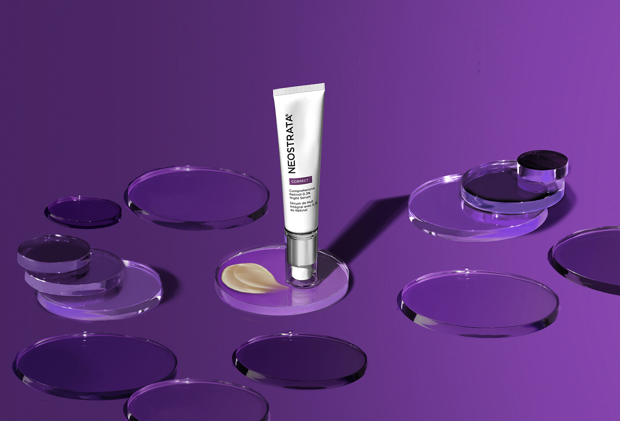
Through the use of bold branding colors and glass discs that hold conceptual visual metaphors, a beautiful new look and feel was created for the brand. The glass discs’ circular shape not only represents discoloration spots but also gives a nod to science (petri dish). Across each collection, the glass discs are used to communicate the specific type of hyperpigmentation being treated.
The center glass discs always hold the products. To communicate efficacy and the product benefit, these discs are clear with beautiful light reflections—a metaphor for even-toned and brighter skin. The outlying discs in each shot represent the problem and the specific type of skin discoloration that each collection treats.
photographed by matthew chaves
The Enlighten collection is for dark spots and stubborn dark spots. The outlying discs are in different sizes and opacities to show how dark spots appear differently, and in different tones, the stubborn spots being the darkest. When in motion, the spots fade and brighten over time until they are all the same color with beautiful light reflections, communicating even tone and an overall brighter complexion.
The Resurface collection is for overall dull skin. Larger discs are used to represent skin’s overall complexion, and outlying discs are frosted and non-reflective to show dullness. When in motion, the discs lose their dullness and brighten over time, becoming more and more reflective. The end benefit is overall brightening and radiant skin.
The Restore collection is for flushed and blotchy skin. Outlying discs are in blushed tones, in different sizes and opacities. Some discs overlap to represent the blotchy, uneven look. Over time, these discs lose their redness and resolve in a beautiful cool-toned world. The shift from the warm to cool toned world speaks to both neutralizing the overall skin tone and the calming/cooling effect that happens when skin is no longer irritated.
The Skin Active collection is for mature aging (sagging and loss of firmness) plus uneven skin tone. The outlying discs are stacked in gradated sizes and opacities to represent the aging process and skin’s uneven layers. When in motion, the stacks of discs shed layer by layer, ending with a single clear disc on the bottom to represent the fresh, smooth surface of renewed skin.
The Correct collection is for aging (fine lines and wrinkles) plus uneven skin tone. Like the previous line, the outlying discs are also stacked in gradated sizes and opacities to represent the aging process and skin’s uneven layers. When in motion, the stacks of discs shed layer by layer, ending with a single clear disc on the bottom to represent the fresh, smooth surface of renewed skin.
The Clarify collection is for acne marks and post acne marks. The outlying discs represent the darker marks left on skin from acne. The center discs, as always, are crystal clear and reflective to show the end benefit of a clear and even complexion.
The Defend collection is for SPF protection. The center disc holds the product, and also has a layered disc on top of the product to represent the UVA/UVB protection. Since this line is focused on prevention, the outlying discs represent the benefit of even tone through the use of SPF.
Cross-collection shots are all photographed on a vibrant amber toned background. This color was chosen because of its brightness, warmth and premium look. This PMS is also ownable to the brand, as other brands who have hyperpigmentation products tend to use more of an orange color.


